
Welcome to the first ever basketball post on this here blog! As announced a few weeks back, CollegeBasketballData.com is now live. I’ve often been asked about providing service for college basketball and have always been hesitant. For one, the sheer volume of data is multiple times greater than for football due to nearly triple the number of teams and triple the number of games per team. I’ve also been a big fan both of Bart Torvik and Ken Pomeroy and wasn’t sure there was much of need for a CFBD-like service for CBB with the stats and analytics those guys provide.
That all said, I have been asked consistently over the years from various users and the CFBD site and API refreshes have made me energized to give CBB a go. I’m excited to provide this service and if I’ve been a part of your CFB analytics journey, I hope I can do the same for CBB.
Now let’s dive into some charts!
We are going to be plotting team shot charts on top of a standard NCAA men’s court using Python and the CollegeBasketballData.com API along with a few common Python packages. When all is said and done, we will have something that looks like this.
Before we do anything, we need to make sure we have all dependencies installed. We will need the CBBD Python package and a few others. Run the following code in terminal.
pip install cbbd pandas numpy matplotlib seaborn
Now we need to focus on plotting a basketball court. We will be using matplotlib to achieve this. Go ahead and run the following block to import all of dependencies we just installed.
import cbbd
import pandas as pd
import numpy as np
import matplotlib.pylab as plt
import matplotlib as mpl
from matplotlib.patches import Circle, Rectangle, Arc
from matplotlib.offsetbox import OffsetImage, AnnotationBbox
import seaborn as sns
plt.style.use(‘seaborn-v0_8-dark-palette’)
As we did into plotting the court, I first need to give a huge shout out to Rob Mulla, who wrote a series of helper functions for plotting NCAA courts on Kaggle. His Kaggle article goes more in-depth and even includes a plot for a full size court. We’ll just be using a half court and copy/pasting a function from that article.
def create_ncaa_half_court(ax=None, three_line=”mens”, court_color=”#dfbb85″,
lw=3, lines_color=”black”, lines_alpha=0.5,
paint_fill=”blue”, paint_alpha=0.4,
inner_arc=False):
“””
Version 2020.2.19
Creates NCAA Basketball Half Court
Dimensions are in feet (Court is 97×50 ft)
Created by: Rob Mulla / https://github.com/RobMulla
* Note that this function uses “feet” as the unit of measure.
* NCAA Data is provided on a x range: 0, 100 and y-range 0 to 100
* To plot X/Y positions first convert to feet like this:
“`
Events[‘X_’] = (Events[‘X’] * (94/100))
Events[‘Y_’] = (Events[‘Y’] * (50/100))
“`
ax: matplotlib axes if None gets current axes using `plt.gca`
three_line: ‘mens’, ‘womens’ or ‘both’ defines 3 point line plotted
court_color : (hex) Color of the court
lw : line width
lines_color : Color of the lines
lines_alpha : transparency of lines
paint_fill : Color inside the paint
paint_alpha : transparency of the “paint”
inner_arc : paint the dotted inner arc
“””
if ax is None:
ax = plt.gca()
# Create Pathes for Court Lines
center_circle = Circle((50/2, 94/2), 6,
linewidth=lw, color=lines_color, lw=lw,
fill=False, alpha=lines_alpha)
hoop = Circle((50/2, 5.25), 1.5 / 2,
linewidth=lw, color=lines_color, lw=lw,
fill=False, alpha=lines_alpha)
# Paint – 18 Feet 10 inches which converts to 18.833333 feet – gross!
paint = Rectangle(((50/2)-6, 0), 12, 18.833333,
fill=paint_fill, alpha=paint_alpha,
lw=lw, edgecolor=None)
paint_boarder = Rectangle(((50/2)-6, 0), 12, 18.833333,
fill=False, alpha=lines_alpha,
lw=lw, edgecolor=lines_color)
arc = Arc((50/2, 18.833333), 12, 12, theta1=-
0, theta2=180, color=lines_color, lw=lw,
alpha=lines_alpha)
block1 = Rectangle(((50/2)-6-0.666, 7), 0.666, 1,
fill=True, alpha=lines_alpha,
lw=0, edgecolor=lines_color,
facecolor=lines_color)
block2 = Rectangle(((50/2)+6, 7), 0.666, 1,
fill=True, alpha=lines_alpha,
lw=0, edgecolor=lines_color,
facecolor=lines_color)
ax.add_patch(block1)
ax.add_patch(block2)
l1 = Rectangle(((50/2)-6-0.666, 11), 0.666, 0.166,
fill=True, alpha=lines_alpha,
lw=0, edgecolor=lines_color,
facecolor=lines_color)
l2 = Rectangle(((50/2)-6-0.666, 14), 0.666, 0.166,
fill=True, alpha=lines_alpha,
lw=0, edgecolor=lines_color,
facecolor=lines_color)
l3 = Rectangle(((50/2)-6-0.666, 17), 0.666, 0.166,
fill=True, alpha=lines_alpha,
lw=0, edgecolor=lines_color,
facecolor=lines_color)
ax.add_patch(l1)
ax.add_patch(l2)
ax.add_patch(l3)
l4 = Rectangle(((50/2)+6, 11), 0.666, 0.166,
fill=True, alpha=lines_alpha,
lw=0, edgecolor=lines_color,
facecolor=lines_color)
l5 = Rectangle(((50/2)+6, 14), 0.666, 0.166,
fill=True, alpha=lines_alpha,
lw=0, edgecolor=lines_color,
facecolor=lines_color)
l6 = Rectangle(((50/2)+6, 17), 0.666, 0.166,
fill=True, alpha=lines_alpha,
lw=0, edgecolor=lines_color,
facecolor=lines_color)
ax.add_patch(l4)
ax.add_patch(l5)
ax.add_patch(l6)
# 3 Point Line
if (three_line == ‘mens’) | (three_line == ‘both’):
# 22′ 1.75″ distance to center of hoop
three_pt = Arc((50/2, 6.25), 44.291, 44.291, theta1=12,
theta2=168, color=lines_color, lw=lw,
alpha=lines_alpha)
# 4.25 feet max to sideline for mens
ax.plot((3.34, 3.34), (0, 11.20),
color=lines_color, lw=lw, alpha=lines_alpha)
ax.plot((50-3.34, 50-3.34), (0, 11.20),
color=lines_color, lw=lw, alpha=lines_alpha)
ax.add_patch(three_pt)
if (three_line == ‘womens’) | (three_line == ‘both’):
# womens 3
three_pt_w = Arc((50/2, 6.25), 20.75 * 2, 20.75 * 2, theta1=5,
theta2=175, color=lines_color, lw=lw, alpha=lines_alpha)
# 4.25 inches max to sideline for mens
ax.plot( (4.25, 4.25), (0, 8), color=lines_color,
lw=lw, alpha=lines_alpha)
ax.plot((50-4.25, 50-4.25), (0, 8.1),
color=lines_color, lw=lw, alpha=lines_alpha)
ax.add_patch(three_pt_w)
# Add Patches
ax.add_patch(paint)
ax.add_patch(paint_boarder)
ax.add_patch(center_circle)
ax.add_patch(hoop)
ax.add_patch(arc)
if inner_arc:
inner_arc = Arc((50/2, 18.833333), 12, 12, theta1=180,
theta2=0, color=lines_color, lw=lw,
alpha=lines_alpha, ls=”–“)
ax.add_patch(inner_arc)
# Restricted Area Marker
restricted_area = Arc((50/2, 6.25), 8, 8, theta1=0,
theta2=180, color=lines_color, lw=lw,
alpha=lines_alpha)
ax.add_patch(restricted_area)
# Backboard
ax.plot(((50/2) – 3, (50/2) + 3), (4, 4),
color=lines_color, lw=lw*1.5, alpha=lines_alpha)
ax.plot( (50/2, 50/2), (4.3, 4), color=lines_color,
lw=lw, alpha=lines_alpha)
# Half Court Line
ax.axhline(94/2, color=lines_color, lw=lw, alpha=lines_alpha)
# Plot Limit
ax.set_xlim(0, 50)
ax.set_ylim(0, 94/2 + 2)
ax.set_facecolor(court_color)
ax.set_xticks([])
ax.set_yticks([])
ax.set_xlabel(”)
return ax
You’ll note that the code has several formatting options and you can even switch between a men’s and women’s courts. CBBD does not currently offer NCAA women’s data, but that is still a very nice feature to have.
Go ahead and run the function without any options specified.
create_ncaa_half_court()
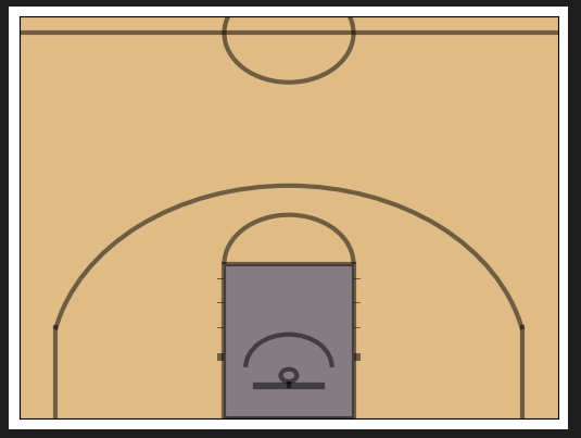
Pretty basic and it just works! We can add some formatting options.
create_ncaa_half_court(three_line=”mens”, court_color=”black”, lines_color=”white”, paint_alpha=0, inner_arc=True)
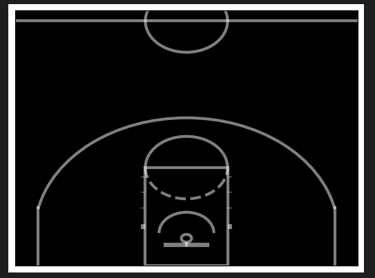
Feel free to mess around more with different court and style combinations.
We will grab shot location data from the CollegeBasketballData.com (CBBD) API. Specifically, we’ll be working with the cbbd Python package (imported above). First, configure your API key, replacing your own API key with the placeholder below. If you need an API key, you can register for a free key via the CBBD main website.
configuration = cbbd.Configuration(
access_token = ‘your_api_key_here’
)
Shot location data is included in play by play data. We can use the CBBD Plays API to grab all shooting plays for a specific team or player. In this example, we will grab team-level data. We will specify season and team parameters. We will also pass in a shooting_plays_only flag to only return shooting plays (i.e. filtering out things like timeouts, rebounds, fouls, etc). The code block below will grab shooting plays associated with Dayton in the 2025 season. Feel free to switch up the team or season.
with cbbd.ApiClient(configuration) as api_client:
plays_api = cbbd.PlaysApi(api_client)
plays = plays_api.get_plays_by_team(season=2025, team=’Dayton’, shooting_plays_only=True)
plays[0]
Example output of a shooting play:
PlayInfo(id=118229, source_id=’401715398101806301′, game_id=426, game_source_id=’401715398′, game_start_date=datetime.datetime(2024, 11, 9, 19, 30, tzinfo=datetime.timezone.utc), season=2025, season_type=, game_type=”STD”, play_type=”LayUpShot”, is_home_team=False, team_id=212, team=’Northwestern’, conference=”Big Ten”, opponent_id=64, opponent=”Dayton”, opponent_conference=”A-10″, period=1, clock=’19:36′, seconds_remaining=1176, home_score=0, away_score=0, home_win_probability=0.635, scoring_play=False, shooting_play=True, score_value=2, wallclock=None, play_text=”Ty Berry missed Layup.”, participants=[PlayInfoParticipantsInner(name=”Ty Berry”, id=5452)], shot_info=ShotInfo(shooter=ShotInfoShooter(name=”Ty Berry”, id=5452), made=False, range=”rim”, assisted=False, assisted_by=ShotInfoShooter(name=None, id=None), location=ShotInfoLocation(y=270, x=864.8)))
We can easily load this up into a pandas DataFrame. The current scale for the x and y coordinates is 10 pts for every 1 foot. Dividing by 10, we can convert that into feet as we import into a DataFrame, which will make it easier to work with the half court plot we ran through above. We will also filter out any shooting plays that may be missing location data for whatever reason.
df = pd.DataFrame.from_records([
dict(
x=p.shot_info.location.x / 10,
y=p.shot_info.location.y / 10,
)
for p in plays
if p.shot_info is not None
and p.shot_info.location is not None
and p.shot_info.location.x is not None
and p.shot_info.location.y is not None
])
df.head()
x
y
0
76.14
29.5
1
22.56
41.0
2
26.32
8.5
3
81.78
31.5
4
69.56
9.5
We have one last step to take to get our data into a usable state. We are currently working with half court plots, but these shot locations correspond to a full court. We will convert the shot locations to half court coordinates by translating locations from the missing half over to the visible half of the court.
df[‘x_half’] = df[‘x’]
df.loc[df[‘x’] > 47, ‘x_half’] = (94 – df[‘x’].loc[df[‘x’] > 47])
df[‘y_half’] = df[‘y’]
df.loc[df[‘x’] > 47, ‘y_half’] = (50 – df[‘y’].loc[df[‘x’] > 47])
# cast these to float to avoid typing issues later
df[‘x_half’] = df[‘x_half’].astype(float)
df[‘y_half’] = df[‘y_half’].astype(float)
We can easily plot this data using matplotlib. For example, we can put it into a scatter plot.
plt.scatter(df[‘y_half’], df[‘x_half’])
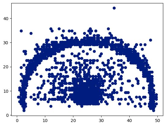
Not very pretty, but you can clearly see a basketball court, including the general outline of the 3-point line.
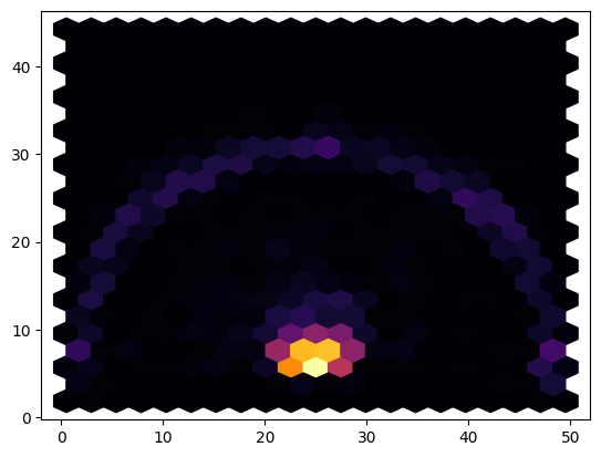
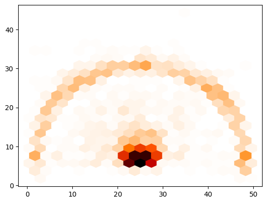
We can improve upon these by making a hexbin chart, which will bucket shots into hexagonal areas of the court to create a sort of heatmap. The below code will create a hexbin plot using the inferno color map.
plt.hexbin(df[‘y_half’], df[‘x_half’], gridsize=20, cmap=’inferno’)
You can view more colormaps here and play around with different color schemes. Just replace inferno in the above snippet with the colormap of our choice. You can also type in plt.cm. and use autocomplete to conveniently see what is available.
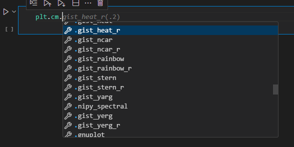
I’m partial to gist_heat_r, so let’s check that one out. We’ll just rerun the code from above, replacing the colormap with that one.
plt.hexbin(df[‘y_half’], df[‘x_half’], gridsize=20, cmap=plt.cm.gist_heat_r)
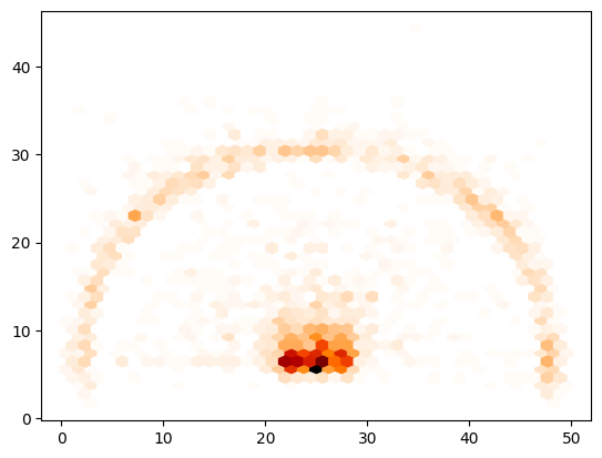
You can also mess around with the gridsize parameter for lower or higher resolution. Here I will increase the value from 20 to 40.
plt.hexbin(df[‘y_half’], df[‘x_half’], gridsize=40, cmap=plt.cm.gist_heat_r)
We’ve plotted an empty half court. We’ve plot actual shot location data points. It’s time to bring that all together. Run the below snippet and then we’ll break it down line by line.
fig, ax = plt.subplots(figsize=(13.8, 14))
ax.hexbin(x=’y_half’, y=’x_half’, cmap=plt.cm.gist_heat_r, gridsize=40, data=df)
create_ncaa_half_court(ax, court_color=”white”,
lines_color=”black”, paint_alpha=0,
inner_arc=True)
plt.show()
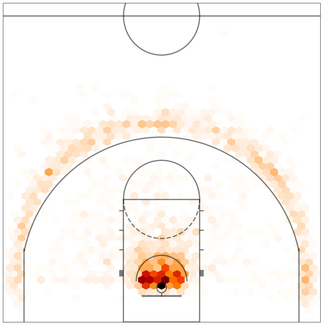
Pretty nice, huh? Let’s walk through it.
On line 1, we are setting the size of the plot and returning the plot fig and ax objects.On line 2, we are using the ax object to create a hexbin plot, almost identical to above.On line 3, we are calling the create_ncaa_half_court function with our desired styling options. The colormap used here works best with a white background.Lastly, we show the court with the plotted hex bins.
Let’s make this even cooler. We’re going to use a library called seaborn, which is built upon matplotlib. It contains many of the base plots found within matplotlib, but with its own tweaks and improvements. It also offers several additional, more advanced types of plots. You can view the gallery here. We are going to be working with a jointplot, which will combine the hexbin chart we created with aspects of a bar chart.
It’s pretty simply. Just run the snippet below to see what it looks like.
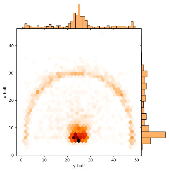
sns.jointplot(data=df, x=’y_half’, y=’x_half’,
kind=’hex’, space=0, color=plt.cm.gist_heat_r(.2), cmap=plt.cm.gist_heat_r)
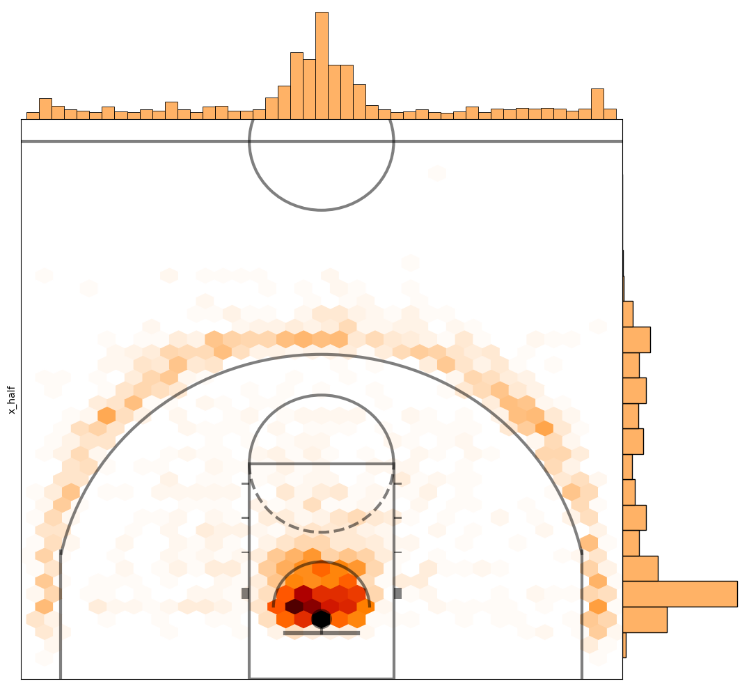
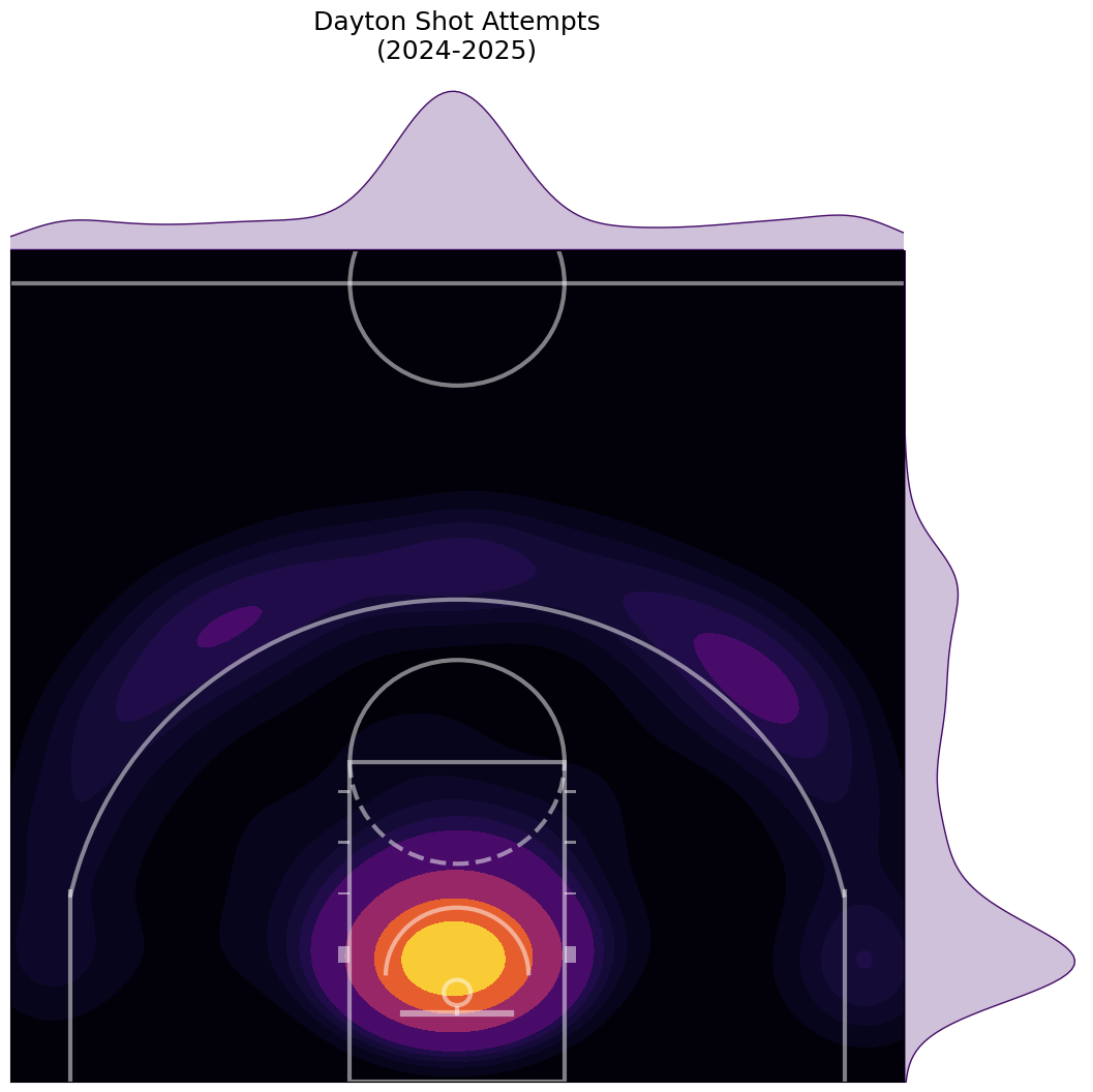
Now put it all together and let’s plot the jointplot on top of our half court plot.
cmap = plt.cm.gist_heat_r
joint_shot_chart = sns.jointplot(data=df, x=’y_half’, y=’x_half’,
kind=’hex’, space=0, color=cmap(.2), cmap=cmap)
joint_shot_chart.figure.set_size_inches(12,11)
# A joint plot has 3 Axes, the first one called ax_joint
# is the one we want to draw our court onto
ax = joint_shot_chart.ax_joint
create_ncaa_half_court(ax=ax,
three_line=”mens”,
court_color=”white”,
lines_color=”black”,
paint_alpha=0,
inner_arc=True)
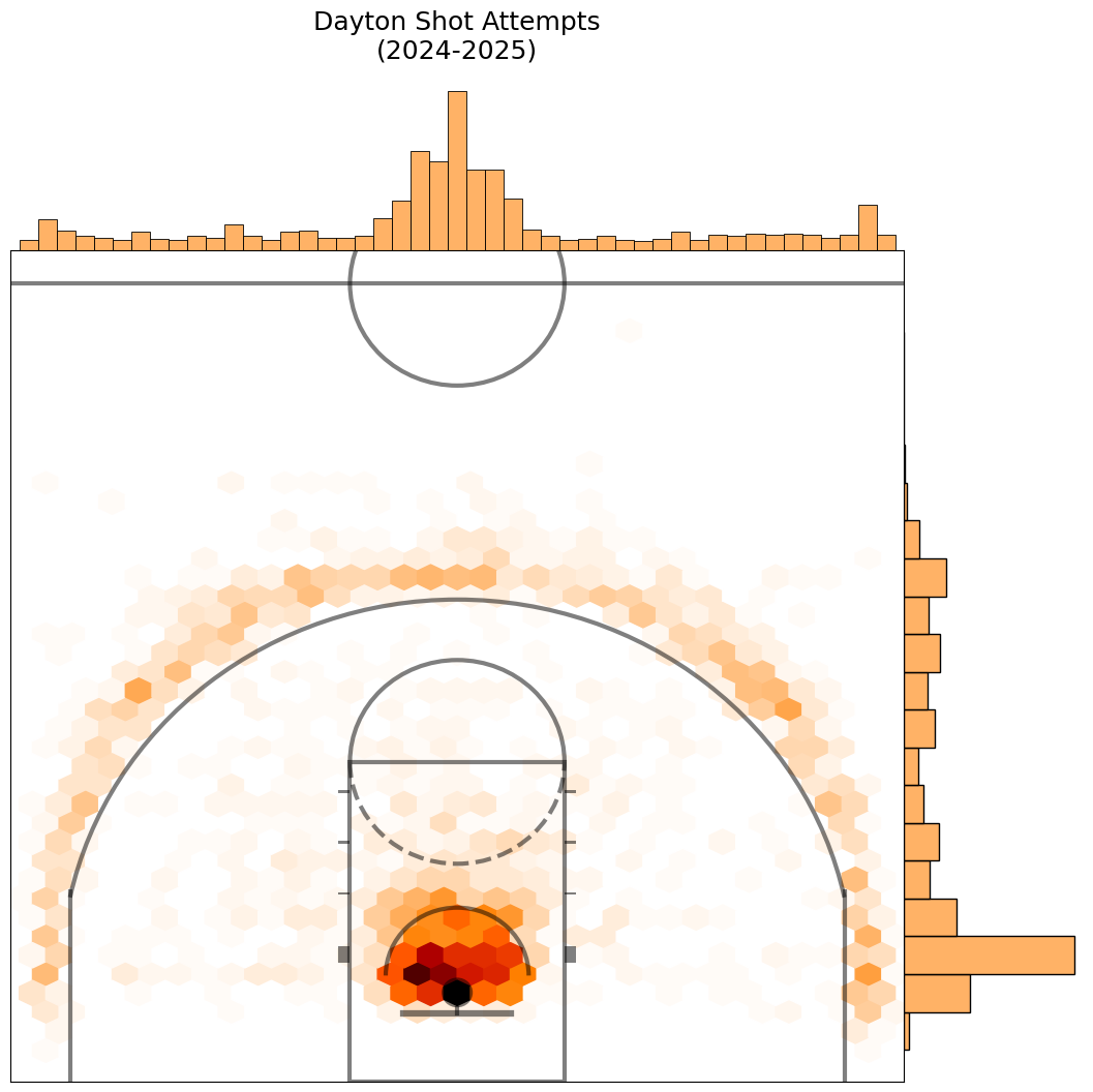
One last thing, let’s remove the access labels and add a title.
cmap = plt.cm.gist_heat_r
joint_shot_chart = sns.jointplot(data=df, x=’y_half’, y=’x_half’,
kind=’hex’, space=0, color=cmap(.2), cmap=cmap)
joint_shot_chart.figure.set_size_inches(12,11)
# A joint plot has 3 Axes, the first one called ax_joint
# is the one we want to draw our court onto
ax = joint_shot_chart.ax_joint
create_ncaa_half_court(ax=ax,
three_line=”mens”,
court_color=”white”,
lines_color=”black”,
paint_alpha=0,
inner_arc=True)
# Get rid of axis labels and tick marks
ax.set_xlabel(”)
ax.set_ylabel(”)
ax.tick_params(labelbottom=’off’, labelleft=”off”)
ax.set_title(f”Dayton Shot Attempts\n(2024-2025)”, y=1.22, fontsize=18)
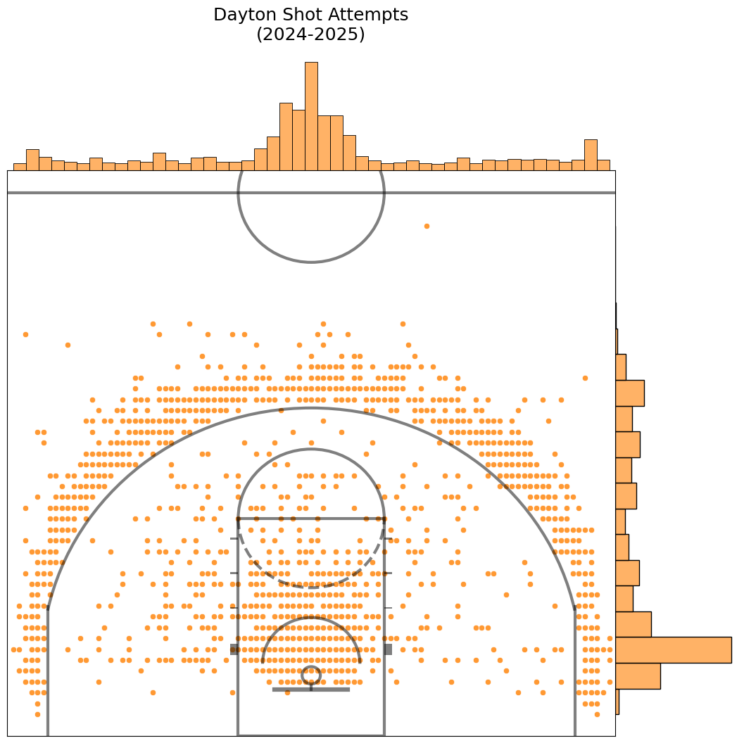
There are other styles of joint plots you can make by changing the kind parameter on line 3 above. For example, changing the kind from hex to scatter results in this.
Here is what happens when we change it to kde.
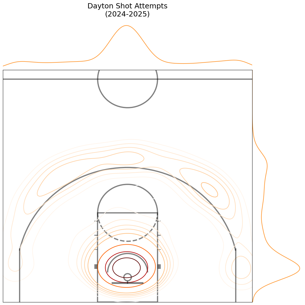
It doesn’t look so great, does it? We can mess around a bit with the styling to make that look a little better. I’m going to change the colormap to inferno, add fill and thresh parameters, and change the half court styling a little bit.
cmap = plt.cm.inferno
joint_shot_chart = sns.jointplot(data=df, x=’y_half’, y=’x_half’,
kind=’kde’, space=0, fill=True, thresh=0, color=cmap(.2), cmap=cmap)
joint_shot_chart.figure.set_size_inches(12,11)
# A joint plot has 3 Axes, the first one called ax_joint
# is the one we want to draw our court onto
ax = joint_shot_chart.ax_joint
create_ncaa_half_court(ax=ax,
three_line=”mens”,
court_color=”black”,
lines_color=”white”,
paint_alpha=0,
inner_arc=True)
# Get rid of axis labels and tick marks
ax.set_xlabel(”)
ax.set_ylabel(”)
ax.tick_params(labelbottom=’off’, labelleft=”off”)
ax.set_title(f”Dayton Shot Attempts\n(2024-2025)”, y=1.22, fontsize=18)
That’s better. See the jointplot docs for more styles, examples, and customizations.
You should now be able to create shot location charts against an actual court using matplotlib and seaborn with the CBBD Python library. There are many ways to take this further:
Plot multiple teams using subplotsPlot made shots and missed shots side-by-side for the same team using subplotsApply the same code to plotting shot charts for specific playersFind new styling and customizations
Lastly, I already cited Rob Mulla and his excellent Kaggle article and helper functions for plotting NCAA basketball courts. I’d be remiss if I also didn’t shout Savvas Tjortjoglou as a drew a lot of inspiration from his article on plotting NBA shot charts.
As always, let me know what you think and happy coding!


 vs. Cincinnati Reds (2-6)")


